Great Ways Power BI Can Be Used to Summarize Your Data
Great Ways Power BI Can Be Used to Summarize Your Data
Businesses generate massive amounts of data every day, but raw data alone doesn’t drive results. What matters is how effectively that data is summarized, analyzed, and communicated. Power BI is one of the most powerful tools available for turning complex datasets into clear, meaningful insights.
Developed by Microsoft, Power BI enables organizations to quickly summarize data, identify trends, and make informed decisions. Below are some of the great ways Power BI can be used to summarize your data and deliver value across your organization.
Interactive Dashboards That Summarize Data at a Glance
One of the best ways Power BI summarizes data is through interactive dashboards. These dashboards bring together key metrics and KPIs into a single, easy-to-read view.

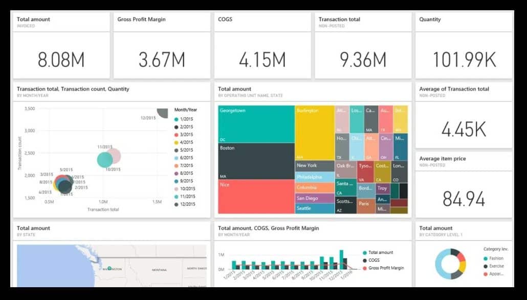
Instead of scrolling through spreadsheets or static reports, users can:
- View real-time summaries of performance
- Drill into details only when needed
- Monitor trends and exceptions instantly
Dashboards are ideal for executives and managers who need fast, high-level summaries without sacrificing detail.
Automatic Aggregation and Grouping of Large Data Sets
Power BI automatically aggregates data, making it easy to summarize thousands—or even millions—of records. With minimal setup, you can summarize data by:
- Region
- Department
- Product
- Time period
This automation reduces manual calculations and ensures consistency across reports, making Power BI an excellent solution for scalable data summarization.
Visual Data Summaries That Improve Understanding
Power BI transforms summarized data into visual insights using charts, graphs, and KPI indicators. These visuals help users understand patterns and relationships that may be difficult to spot in raw tables.
Common visual summaries include:
- Bar and column charts for comparisons
- Line charts for trend analysis
- Pie and donut charts for proportions
- KPI visuals to track goals and performance
Visual summaries make data accessible to both technical and non-technical users.
Drill-Down Reporting for Deeper Insights
Power BI allows users to start with summarized data and drill down into more detailed views. For example, a sales summary can be expanded to show performance by territory, salesperson, or product.
This approach:
- Keeps reports clean and focused
- Eliminates the need for multiple versions of the same report
- Empowers users to answer their own questions
Drill-down functionality is a key reason Power BI is so effective at data summarization.
Time-Based Summaries and Trend Analysis
Another great way Power BI summarizes data is through time-based analysis. Using built-in date intelligence, Power BI can quickly summarize data over time and highlight trends.
You can easily analyze:
- Month-over-month and year-over-year changes
- Seasonal patterns
- Rolling totals and averages
These time-based summaries are critical for forecasting, budgeting, and performance tracking.
Combining and Summarizing Data from Multiple Sources
Power BI can connect to multiple data sources—such as Excel, databases, accounting systems, and CRM platforms—and summarize them into a single model.
This allows organizations to:
- Create one version of the truth
- Eliminate disconnected reports
- Summarize cross-functional data in one place
Once connected, Power BI automatically refreshes and updates summarized results.
Filtered Summaries for Different Audiences
Power BI uses filters and slicers to create customized summaries without duplicating reports. Executives, managers, and analysts can all view the same data but focus on what matters most to them.
Examples include:
- Filtering by region or department
- Summarizing results for a specific time period
- Comparing performance across teams
This flexibility makes Power BI summaries both powerful and user-friendly.
Real-Time Data Summarization for Faster Decisions
Power BI supports scheduled and real-time data refreshes, allowing summaries to stay current. This is especially valuable for operational dashboards and performance monitoring.
Up-to-date summaries help organizations:
- React quickly to issues
- Track progress in real time
- Make data-driven decisions with confidence
Conclusion: Why Power BI Is Ideal for Data Summarization
When it comes to summarizing data effectively, Power BI stands out as a best-in-class solution. From interactive dashboards and visual summaries to drill-down analysis and real-time reporting, Power BI turns raw data into insights that drive action.
If your organization is still relying on static spreadsheets or manual reports, exploring the great ways Power BI can be used to summarize your data could be a game-changer.
For many live webinars on Excel, PowerBI, ChatGPT, CoPilot, and other topics, go to